
The User Experience Design team provides regular tips to Registrar Connections, the monthly newsletter published by VeriSign for ICANN-accredited registrars and other domain name industry professionals.
SSL: User-Centered Design and VCC
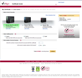
User-centered design helps uncover the user's needs through an iterative process of usability testing and design. The original idea for VCC came about as a result of CELP user testing, during which it was noted that many customers would like a central place to manage their VeriSign retail certificates.
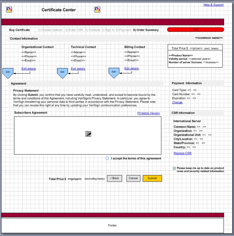
The User Experience team created a prototype of what VCC might look like, working with product management simultaneously as the MRD was created. Once the basic features and business needs were determined, the UXD team brainstormed to figure out the best way to incorporate those needs into the application, always thinking of ease of use, branding, and elegant design.
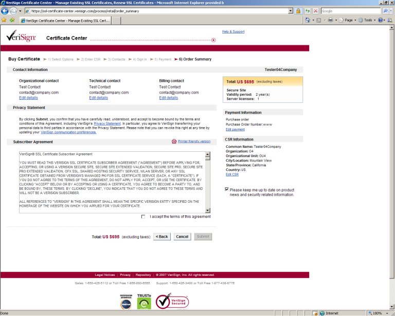
Three rounds of usability testing helped the team develop the product. Each night the team modified and improved the prototype in response to what was discovered during testing. By the end of the process, we had a working prototype that was validated by the users. This enabled us to write a UI spec that describes the look and behavior of the UI, which could then be handed off to engineering along with mockups.
VeriSign Certificate Center (VCC) went live in July of 2007. A replacement for the CELP platform, VCC has many advantages that make it better for the SSL Certificate user and better for VeriSign, among them:
The User Experience team was involved in the design of the product from the beginning, employing user-centered design (UCD) techniques all the way to ensure that the product would meet the needs of our customers and that it would be easy to migrate our user base from challenge phrase to username/password. Starting with user research, pencil drawings, and Visio diagrams, the group brainstormed issues ranging from how to help the user create an account to resetting a password to how to reduce customer support contacts.
As each iteration was created, it was tested with real customers to make sure that what we were designing made sense to them. By the time we finished with the user testing, we had 100% success from our customer users in their ability to buy and renew, create an account, migrate from challenge phrase to username, and understand their certificate order status.
The Web development and engineering were done in Cape Town. The User Experience team provided a mockup for each Web page, specs, prototypes, reviews, test results, and guidelines to Cape Town. The User Experience designers continued to work along with each sprint, refining the design, and reviewing engineering handoffs.
Click here to see the collection of design materials from VCC 1.0.
Today the application continues to change and refine through Offermatica testing, which marketing uses to see if incremental changes to a page help drive more sales.
Krista Van Laan, Maryam Najafi, Venkat Mallineni, Shima Kazerooni, and Victoria Vos defined and created the user experience for VCC, with John Freedman providing the content.
Today the team is working on VCC 1.5, which will be offered to our EMEA sites.
Important considerations for the user experience includes making sure the users understand the different locales and which one they should be buying from. We have also been working on the UI for including tax calculations relevant to different locales and language selection. 
 Back
Back